

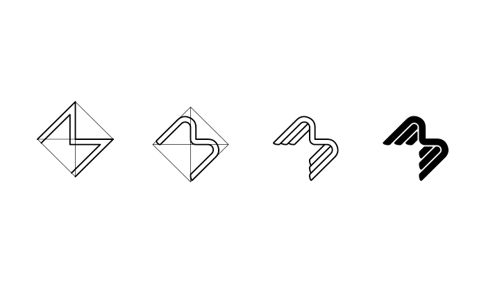


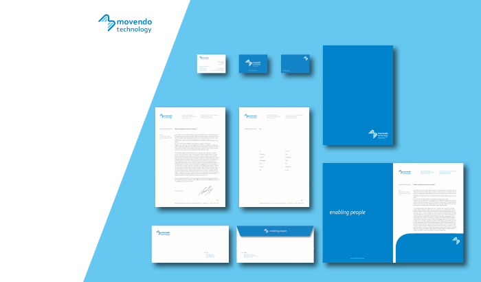
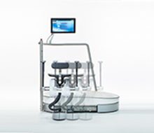
While working with the Italian Institute of Technology we have been asked to design the logo and brand identity of the rising start-up Movendo Technology. The identity was built around the concept of an angel who takes care of the patient. The solution was to shape it as a winged M, with a dynamic design pointing forward and to the top. This movement represents the company’s willing to fly towards the future and the innovation, but not too seriously: the corporate logo and font have a light, rounded, almost fun personality.
Movendo Technology
- Categories →
- branding
-
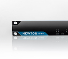
Newton

-
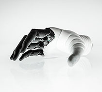
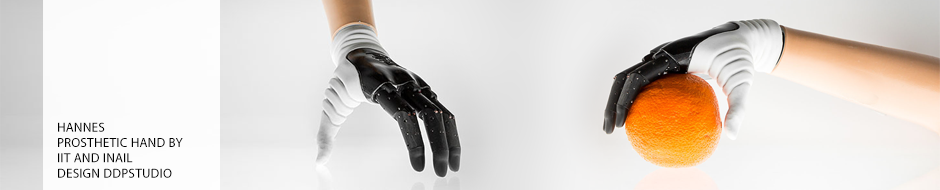
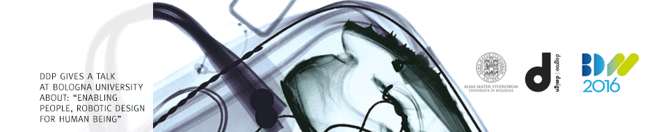
Hannes
-

Telema
-

Movendo Technology
-
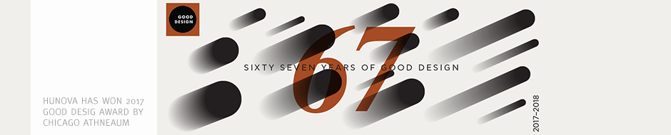
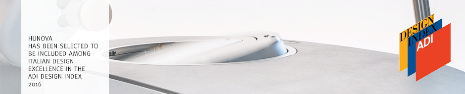
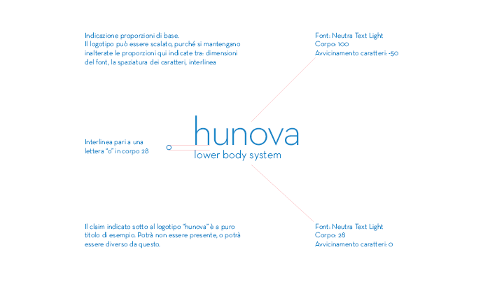
Hunova
-
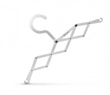
Pliable coat-hanger
-
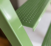
OBG Scala Bella
-
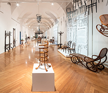
La poltrona moderna
-

Casquet
-
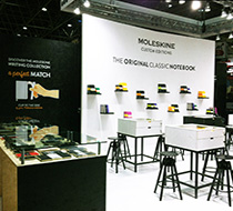
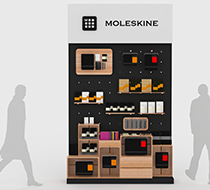
PSI Fair Moleskine
-
Metamorfosis
-
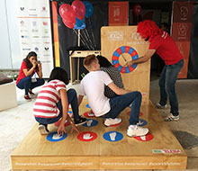
Food Exhibition
-
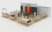
SPS Fair Stand
-
we are hot we are cool
-
Moleskine Fair
-
O-lux
-
Module-M
-
GP Monza 2013
-
Stand Sardegna
-
Nomadic Frame
-

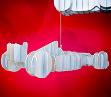
Pistons
-
London Olympics
-

SPS Fair stand
-
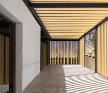
Housing
-
![[auto’mobile]](http://www.ddpstudio.eu/wp-content/themes/yin_and_yang_1.1.3/timthumb.php?src=http://www.ddpstudio.eu/wp-content/uploads/2013/03/FRONT.jpg&h=190&w=220&q=90)
[auto’mobile]
-
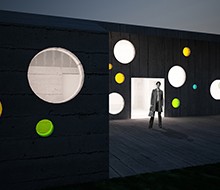
Sports centre
-
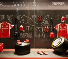
F1 Box
-

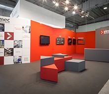
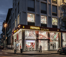
Elmec brand identity
-
GP Monza
-
Starting Grid
-

House CSL
-

Rugiada
-
Silhouette
-

Shirt guard
-
Walk around Bookmark
-
Contact Holder
-
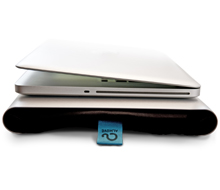
Mac holder
-
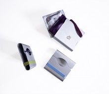
Condom Holder
-

Almove art direction
-

Kamari
-

Bevetene tutti